


Table of Contents
Introduction
Data visualization tools such as Power BI help companies understand their data better. Despite their potential, many users face challenges when designing Power BI dashboards. Cluttered layouts, confusing visuals, and poor structure can reduce a dashboard’s effectiveness and hinder decision-making. To help you overcome these challenges, this blog explores best practices for designing Power BI dashboards that are clear, insightful, and action-driven. Take a look at this poorly designed-dashboard. Can you spot the design mistakes?
At first glance, this dashboard might seem acceptable, but it violates key design principles essential for effective Power BI dashboards.

Further reading: How to Integrate Multiple Data Sources in Power BI
Common Pitfalls & Best Practices for Power BI Dashboards Design
- Fails to Maintain an At-a-Glance View: The dashboard extends beyond a single screen, requiring users to scroll to see all the information. This disrupts the flow and makes it difficult to get a quick, comprehensive overview of the data.
- Misaligned Elements: Visual elements like gauges and KPI cards are not aligned properly, leading to an inconsistent and unprofessional layout that can confuse users.
- Unnecessary or Redundant Information: The dashboard includes extraneous details, such as irrelevant images and repetitive data (like displaying “Total Sales” in both a gauge and a KPI card). This clutter can distract from the key insights.
- Not Starting from Zero: The gauge visualization doesn’t start from zero, which can distort the perception of data magnitude and potentially mislead the viewer.
- Lengthy Data Labels: Data labels are too long and include unnecessary decimal points, making the dashboard harder to read and reducing its clarity.
- Lack of Clarity in Visuals: Overcrowded visuals, such as pie charts and bar charts, make it difficult to extract meaningful insights. The absence of legends further complicates understanding by leaving users guessing what each segment represents.
- Inappropriate Color Selection: A dark background combined with poor color choices reduces visual appeal and readability, making the dashboard less effective in conveying information.`
Now that we’ve identified the shortcomings of our cluttered dashboard, let’s explore some best practices for creating effective Power BI dashboards and mastering Power BI visualization techniques.

Essential Best Practices for Power BI Dashboards Design
How to make a Power BI dashboard is a common dilemma for businesses that don’t have the resources to do so. As a leading Microsoft solution provider, AlphaBOLD has customized Power BI solutions to fit business’s needs. Through our experience we have identified the following best practices for Power BI dashboards designs. Regardless of the industry functions, make sure to the following best practices for Power BI dashboards designs.
1. Know Your Audience:
2. Eliminate Unnecessary information:
3. Keep Typography Simple:
Is Your Dashboard Helping or Confusing Users?
Get a quick expert review and identify design gaps impacting decision-making.
Get Expert review of your Dashboard4. Choose the Right Visualization Techniques:
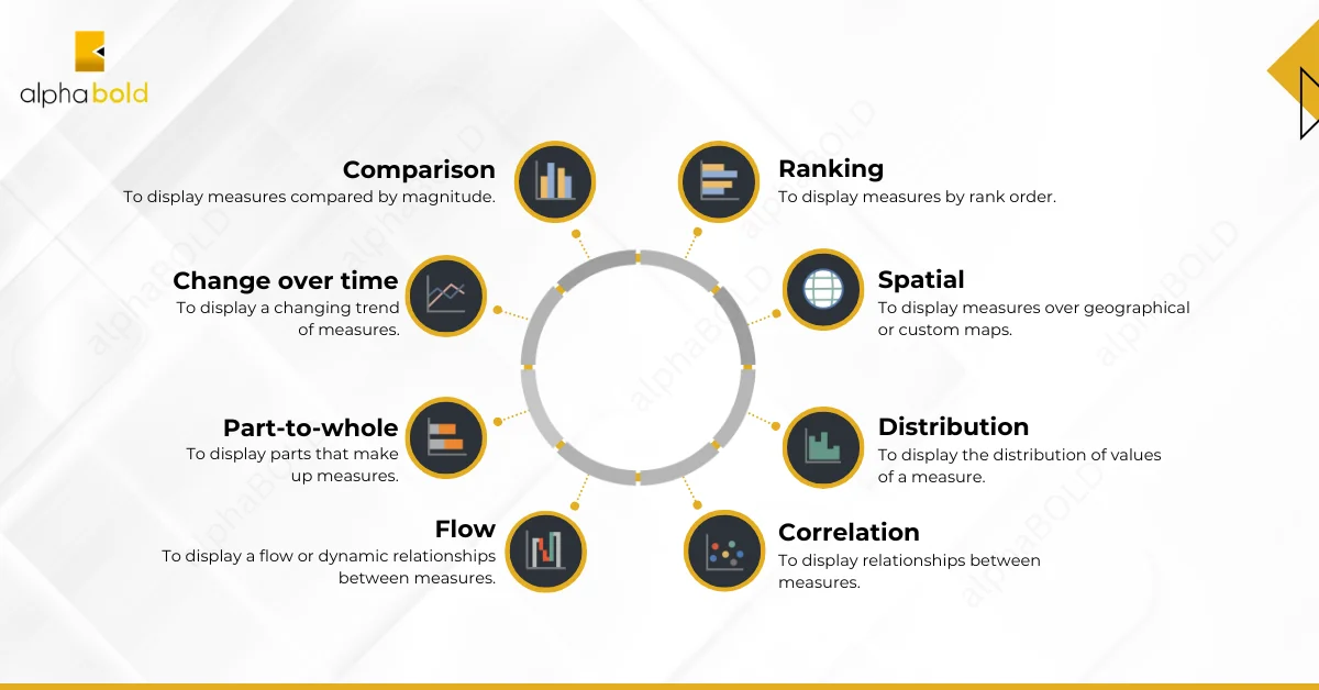
Power BI offers a wide range of visualization options, but choosing the right one is key to effective dashboard design. Use the chart type that best suits your data and the story you want to tell:
- Bar and Column Charts: Ideal for comparing categories or tracking changes over time.
- Line Charts: Great for illustrating trends and patterns.
- Pie Charts: Best for showing proportions of a whole, but limit them to 6-7 categories for optimal readability.
Explore how Power BI enables real-time data visualization, leading to instant decision-making: Importance of Real-time Data Visualizations in Power BI
The following image can help you in choosing the right visuals:
5. Keep Everything At-a-Glance:
Design your Power BI dashboard to display all essential information within a single screen. This approach allows users to quickly grasp key insights without scrolling or searching.
- Prioritize Key Data: Focus on the most critical metrics and use interactive features like slicers and filters to let users explore deeper insights without cluttering the initial view.
- Highlight Important Information: Place critical insights and key performance indicators (KPIs) prominently at the top of the dashboard. Use visual cues such as color contrasts or larger fonts to draw attention to these areas.
6. Align Visual Elements & Maintain Consistency:
A well-designed Power BI dashboard guides the user’s eye naturally and creates a seamless experience.
- Create a Clear Visual Hierarchy: Use size, color, and positioning to establish a hierarchy that directs users’ focus to the most important information first.
- Leverage Whitespace: Utilize whitespace effectively to balance the layout, enhance visual clarity, and prevent overcrowding.
- Ensure Consistent Design Elements: Maintain consistency in design by using uniform colors, fonts, and styling throughout the dashboard. This creates a cohesive and professional look, making the dashboard easier to navigate and understand.
7. Starting Visualizations from Zero:
8. Simplifying Data Labels:
Keep data labels concise by using short descriptions and minimizing the number of decimal points. This makes the labels cleaner, less cluttered, and easier to read. Include currency symbols or units where necessary to provide context and clarify what is being presented, allowing users to quickly understand the data type.
9. Selecting Appropriate Colors:
- Choose a Lighter Background: A lighter background improves readability and reduces eye strain, which is particularly beneficial for prolonged use.
- Create Contrast with Visual Elements: Use contrasting colors to make key visual elements stand out, enhancing visibility and comprehension.
- Enhance Visual Appeal: A thoughtful color palette not only makes the dashboard visually appealing but also increases user engagement by drawing attention to important insights.
10. Tell a Compelling Story:
Design your Power BI dashboard to tell a story with the data. Start with a high-level overview or summary, and then move on to more detailed insights and supporting visuals. Use annotations, text boxes, and other narrative elements to provide context and highlight key findings. A well-structured dashboard helps guide users through the data, ensuring they understand the insights and take appropriate actions.
To get more insights into other Power BI best practices and limitations, read our blog post: Performance and Limits of Power BI
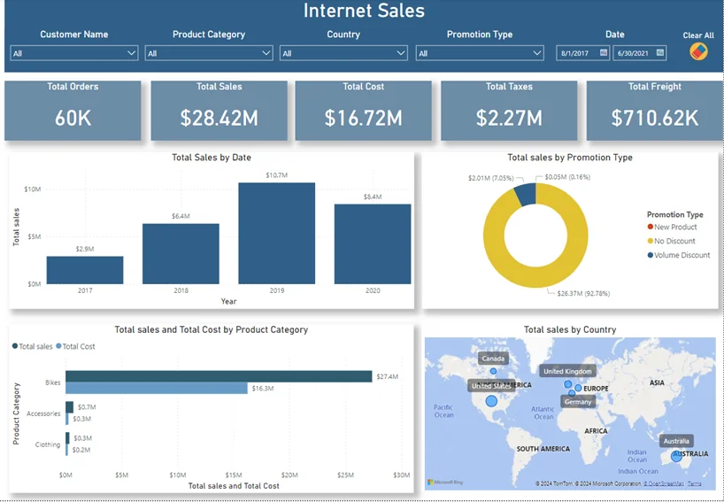
Fix Your Power BI Dashboard for Better Decisions
Our experts help you design dashboards that drive clarity, adoption, and business impact.
Get Your Power BI AssessmentConclusion
Designing effective Power BI dashboards involves thoughtful planning and attention to detail. By applying these best practices, you can create dashboards that deliver valuable insights and empower users to make confident, data-driven decisions. Focusing on user needs and maintaining a commitment to clear, impactful design will help transform your Power BI dashboards into powerful tools that drive business success.
FAQs
1. How do we justify a $100K+ Power BI investment when our current Excel reports seem to work fine?
While Excel may handle basic reporting, it creates hidden costs that compound over time. Manual Excel processes typically consume 40% of your finance team’s time on data preparation rather than analysis. Power BI eliminates these inefficiencies while providing real-time insights that Excel simply cannot deliver. Consider this: if your C-suite makes one strategic decision 30 days faster due to real-time data visibility, the revenue impact often exceeds the entire BI investment. The question isn’t whether you can afford Power BI—it’s whether you can afford to make critical business decisions with outdated information while competitors leverage real-time intelligence.
2. What happens to our competitive advantage if we’re using the same BI tools as our competitors?
The tool itself isn’t your competitive advantage—it’s how you leverage data to drive unique business insights and faster decision-making. Power BI becomes a competitive differentiator when combined with your proprietary data sources, industry-specific KPIs, and organizational intelligence. Companies that excel with Power BI don’t just visualize standard metrics; they uncover hidden patterns in customer behavior, optimize operational inefficiencies competitors can’t see, and predict market shifts before they happen. Your competitive edge lies in asking better questions of your data, not just having better tools.
3. Should we build our BI capabilities in-house or partner with specialized consultants like AlphaBOLD?
Building enterprise-grade BI capabilities in-house typically requires 12-18 months and $1-2M in hiring, training, and trial-and-error costs. Most organizations underestimate the complexity of data modeling, security implementation, and change management required for successful adoption. Specialized consultants bring battle-tested methodologies, pre-built industry frameworks, and expertise from dozens of similar implementations. The strategic question is: do you want your internal team spending 18 months learning Power BI, or do you want them using proven solutions to drive business results within 90 days?
4. How do we ensure our Power BI investment doesn’t become another expensive “shelfware” like our previous BI initiatives?
Shelfware happens when organizations focus on technology deployment rather than business adoption. Successful Power BI implementations start with identifying specific business decisions that need better data support—not with building dashboards. Ask yourself: what $10M decisions are you making quarterly that would benefit from better data visibility? Which operational bottlenecks cost you $100K monthly due to delayed insights? Start with these high-impact use cases, demonstrate clear ROI, then expand. Additionally, embed Power BI usage into existing business processes rather than creating separate “reporting activities” that compete with daily priorities.
5. What’s our biggest risk if we delay our Power BI implementation for another fiscal year?
The greatest risk isn’t technological—it’s strategic blindness in an increasingly data-driven market. While you’re debating implementation, competitors are identifying customer churn patterns you can’t see, optimizing pricing strategies based on real-time market data, and making supply chain adjustments that improve margins. Each quarter of delay compounds the competitive gap. More critically, consider the opportunity cost: if Power BI helps you identify just one new revenue stream worth 2% of annual revenue, delaying implementation for 12 months essentially costs you that entire revenue opportunity. In today’s market velocity, the cost of indecision often exceeds the cost of imperfect action.
Explore Recent Blog Posts